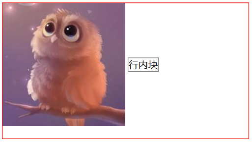
1.垂直居中对齐
- 图片跟行内块中部对齐:图片和行内块都设置vertical-align:middle;
1
2
3
4
5
6
7
8
9
10
11
12
13
14
15
16
17
18
19
20
21
<div class="div1">
<img src="./bird.png" alt="">
<span>行内块</span>
</div>
<style>
.div1{
border: 1px solid red;
width: 400px;
height: 220px;
}
img{
border: 1px solid purpel;
vertical-align: middle; // 设置
}
span{
display: inline-block;
border: 1px solid gray;
vertical-align: middle; // 设置
}
</style>
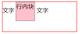
- 文字跟行内块中部对齐:行内块设置vertical-align:middle;
1
2
3
4
5
6
7
8
9
10
11
12
13
14
15
16
17
18
19
20
21
<div class="div1">
文字
<span>行内块</span>
文字
</div>
<style>
.div1{
border: 1px solid red;
width: 200px;
height: 80px;
}
span{
display: inline-block;
width: 50px;
height: 50px;
border: 1px solid gray;
vertical-align: middle; // 设置
background-color: pink;
}
</style>
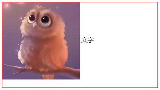
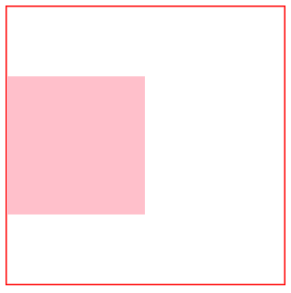
- 文字跟图片中部对齐:图片设置vertical-align:middle;
1
2
3
4
5
6
7
8
9
10
11
12
13
14
15
16
<div class="div1">
<img src="./bird.png" alt="">
文字
</div>
<style>
.div1{
border: 1px solid red;
width: 400px;
height: 220px;
}
img{
border: 1px solid purpel;
vertical-align: middle;
}
</style>
2.垂直居中
- 盒子中块元素垂直居中:块元素position: relative;top:50%;margin-top:—盒子高度的一半;
1
2
3
4
5
6
7
8
9
10
11
12
13
14
15
16
17
18
19
<div class="div1">
<div class="div2"></div>
</div>
<style>
.div1{
border: 1px solid red;
width: 200px;
height: 200px;
}
.div2{
background: pink;
width: 100px;
height: 100px;
position: relative; // 相对定位
top: 50%; // 设置
margin-top: -50px; // 设置
}
</style>
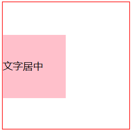
- 盒子中行内块(有字)垂直居中:父盒子及行内块设置line-height:盒高;并且行内块vertical-align: middle;
1
2
3
4
5
6
7
8
9
10
11
12
13
14
15
16
17
18
19
20
<div class="div1">
<span>文字居中</span>
</div>
<style>
.div1{
border: 1px solid red;
width: 200px;
height: 200px;
line-height: 200px; // 设置
}
span{
display: inline-block;
background: pink;
width: 100px;
height: 100px;
line-height: 100px; // 设置
vertical-align: middle; // 设置
}
</style>
- 盒子中行内块(无字)垂直居中:盒子line-height:盒高;并且行内块vertical-align: middle;
- 盒子中图片垂直居中:盒子line-height:盒高;并且图片vertical-align: middle;
- 盒子中行内元素垂直居中:盒子line-height: 盒子高
- 盒子中单行文本垂直字居中:盒子line-height: 盒子高
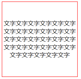
- 盒子中多行文本垂直字居中:使用vertical-align实现垂直居中,不过vertical-align仅适用于内联元素和table-cell元素,因此之前需要转化。
1
2
3
4
5
6
7
8
9
10
11
12
13
14
<div class="div1">
文字文字文字文字文字文字文字文字文字文字文字文字文字文字文字文字文字字文字文字文字文字文字文字文字文字文字文字文字
</div>
<style>
.div1{
border: 1px solid red;
width: 200px;
height: 200px;
text-align: center;
display: table-cell;
vertical-align: middle;
}
</style>
3.水平居中
1.盒子中块元素居中:margin:0px auto;
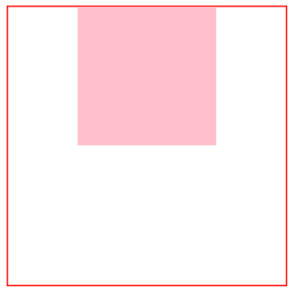
2.盒子中行内块、图片、行内元素、文字等居中:text-align:center;1
2
3
4
5
6
7
8
9
10
11
12
13
14
15
16
17
18<div class="div1">
<span></span>
</div>
<style>
.div1{
border: 1px solid red;
width: 200px;
height: 200px;
text-align: center;
}
span{
display: inline-block;
width: 100px;
height:100px;
background-color: pink;
}
</style>
4.居中
- 绝对定位居中(利用margin实现偏移)
- 绝对定位居中(利用margin:auto实现偏移)
同样对子盒子实现绝对定位,这里使用top、right、bottom、left均为0,margin为auto实现偏移。 绝对定位居中(利用transform实现偏移)
1
2
3
4
5
6
7
8
9
10
11
12
13
14
15
16
17
18
19<div class="parentDiv">
<div class="childDiv">tableCell</div>
</div>
[CSS]
.parentDiv {
position: relative;
}
.parentDiv .childDiv {
position: absolute;
left:50%;
top:50%;
-webkit-transform: translate(-50%, -50%);
-moz-transform: translate(-50%, -50%);
-ms-transform: translate(-50%, -50%);
-o-transform:translate(-50%, -50%) ;
transform:translate(-50%, -50%);
}table-cell元素居中
able-cell实现居中,将父盒子设置为table-cell元素,设置text-align: center; vertical-align: middle;子盒子设置为inline-block元素1
2
3
4
5
6
7
8
9
10
11
12
13
14
15
16
17
18
19
20<div class="parentDiv tableCell">
<div class="id1">
<div class="childDiv">tableCell</div>
</div>
</div>
[CSS]
.tableCell {
display: table;
}
.tableCell .id1 {
display: table-cell;
text-align: center;
vertical-align: middle;
}
.tableCell .childDiv {
display: inline-block;
}Flexbox居中
使用弹性盒模型(flexbox)实现居中。1
2
3
4
5
6
7
8
9
10
11
12
13
14
15
16
17
18
19
20
21
22<div class="parentDiv flexBox">
<div class="childDiv">tableCell</div>
</div>
[CSS]
.flexBox {
display: -webkit-box; /*Safari*/
display: -moz-box; /*Firefox*/
display: -ms-flexbox; /*IE*/
display: -webkit-flex; /*Chrome*/
display: flex;
-webkit-box-align: center;
-moz-box-align: center;
-ms-flex-align: center;
-webkit-align-items: center;
align-items: center;
-webkit-box-pack: center;
-moz-box-pack: center;
-ms-flex-pack: center;
-webkit-justify-content: center;
justify-content: center;
}
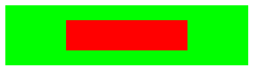
注:以上代码的公共样式:1
2
3
4
5
6
7
8
9
10
11
12
13
14
15
16
17
18<style>
* {
-webkit-box-sizing: border-box; /*Safari*/
-moz-box-sizing: border-box; /*Firefox*/
box-sizing: border-box;
}
.parentDiv {
width:400px;
height: 100px;
background-color: #00ff00;
margin: 20px;
}
.childDiv {
width: 200px;
height:50px;
background-color: #ff0000;
}
</style>
以上代码的效果图: